The Hungry Fox, a ready-meal brand from Vietnam, is founded on a simple insight. The complaint I heard the most from my mother growing up was "Why do you skip your breakfast?" or "Those junk food is never as good as mine". But in the hustle and bustle of Gen Z lives, it is not easy to maintain a healthy lifestyle. That's why we have no choice but to disappoint our mothers and buy ready meals instead of cooking them ourselves. The Hungry Fox aims to provide delicious and convenient meals for young people, yet as nutritious as home-cooked food.
This identity was carefully designed to suit Asian youth culture, providing a cute, active, and approachable look that captures the essence of youthful joy and contentment.
This identity was carefully designed to suit Asian youth culture, providing a cute, active, and approachable look that captures the essence of youthful joy and contentment.
—
Logo
The logotype is designed with bold, impressive trokes that make it stand out on the packaging and capture attention instantly. Balanced with that strong personality are soft curves and rounded corners. They give the design a harmonious look while radiating a close, natural and, approachable energy. The logo highlight is a lovely fox tail that differentiates the logo and balances the design.

—
Character
Character
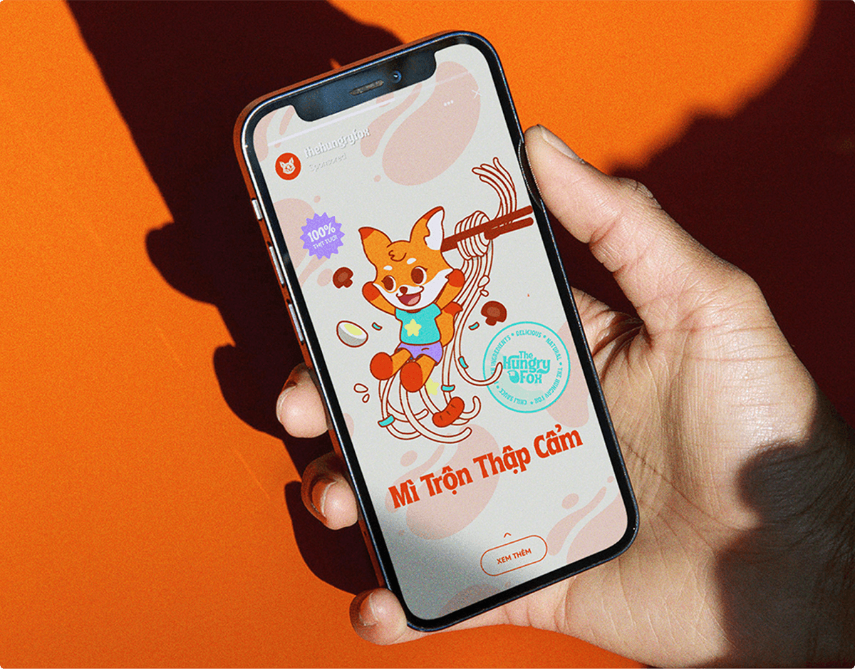
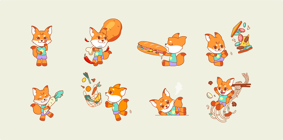
The Hungry Fox character, an orange fox named Ichi, is a gourmet whose greatest passion is delicious food and is always hungry. They are active, friendly, and a bit mischievous. White rice served with fried chicken thighs always makes their mouth water.
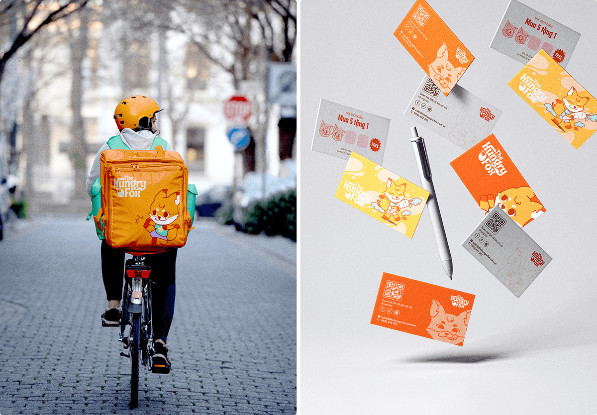
This character is created to play a key role in shaping the brand and connecting with the audience on a deep level. They have gone beyond being mere emojis, but a trending icon. They showcase fun merchandise, animations, capturing the hearts of Gen Zers with their approachable personalities and captivating designs.
This character is created to play a key role in shaping the brand and connecting with the audience on a deep level. They have gone beyond being mere emojis, but a trending icon. They showcase fun merchandise, animations, capturing the hearts of Gen Zers with their approachable personalities and captivating designs.

—
Color Palette
Color Palette
The color palette, featuring light orange, is a unique choice that radiates youthful dynamism, confidence, enthusiasm, and warmth. Orange symbolizes the vibrancy and playfulness of youth, in line with the desire to express themselves and make a mark on the world. Orange combined with turquoise and light purple creates an attention-grabbing palette that stands out visually.

—
Typography
Typography
Font Tropical Island Int graciously expresses the concept of a healthy meal through thick, solid lettering as an affirmation of product quality. This stylish font is best used for headings, logotypes, categories and titles, adding a feel of fulfillment and prominence. Complementing this, SVN-Product Sans font steps in seamlessly, perfectly suited for sub-headlines and body text, ensuring a harmonious and stylish typographic ensemble.

—
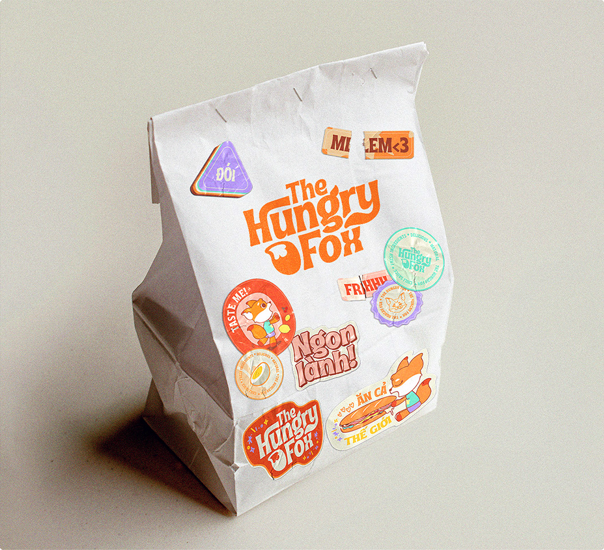
Packaging
Packaging
Our packaging combines bold, minimalist elements to create a distinctive look that sets us apart from our competitors. The middle of our packaging leaves ample space for our adorable character to take the spotlight, ensuring they shine like no other. This sense of playfulness and humour not only engages the audience but also adds excitement and relatability to the overall product experience.